Point of View
|
|
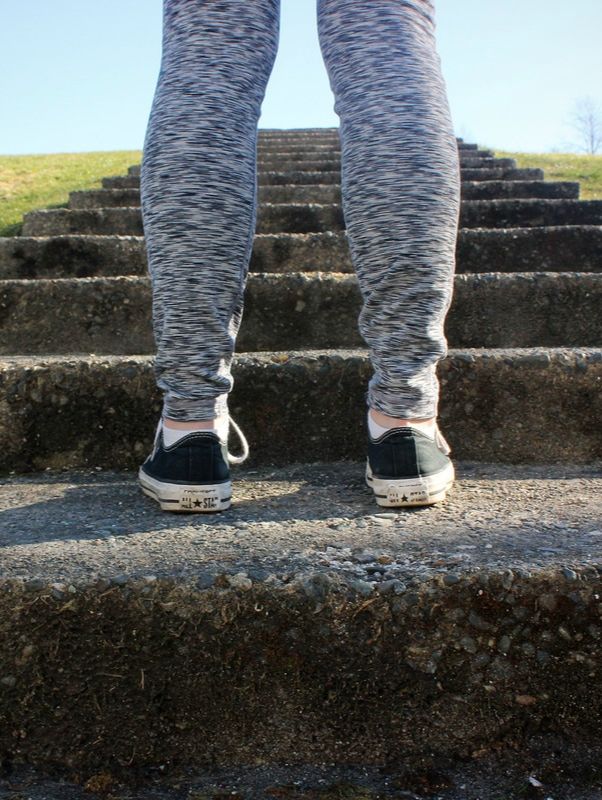
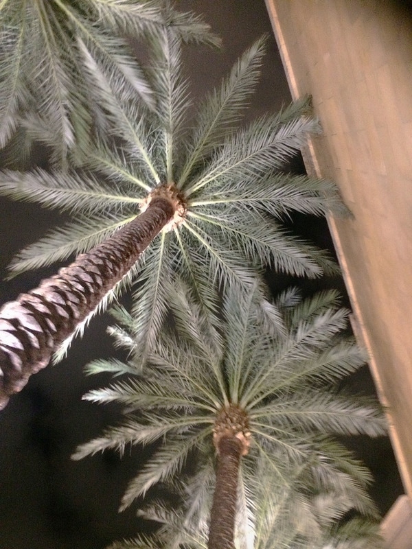
My first worm’s eye view picture is of Rosy standing at the bottom of a staircase. The angle of the picture makes it seem as though the staircase is really tall and reminds me of how staircases or steep mountains symbolize tough situations and that’s what I tried to do as well. My second worm’s eye view is one that I took quite a while ago. It is of some palm trees growing beside the hotel I stayed at when I went to Las Vegas over the summer. I really liked how the lighting looked because it was nighttime and the only lighting was only coming from the bottom of the trees. The point of view of the picture shows how tall the palm trees were. The wall beside the trees also serves as something to compare the height of the trees to, but I would’ve preferred to have been able to crop it out without having to get rid of half of the photo.
Fairytale
|
|
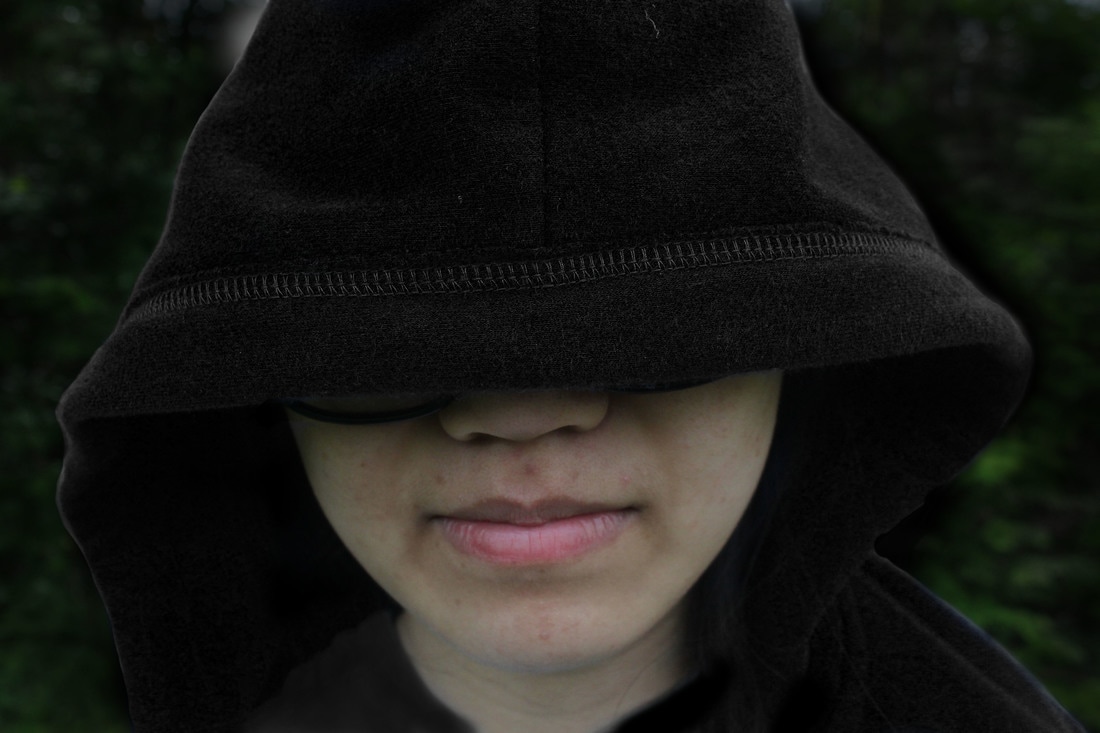
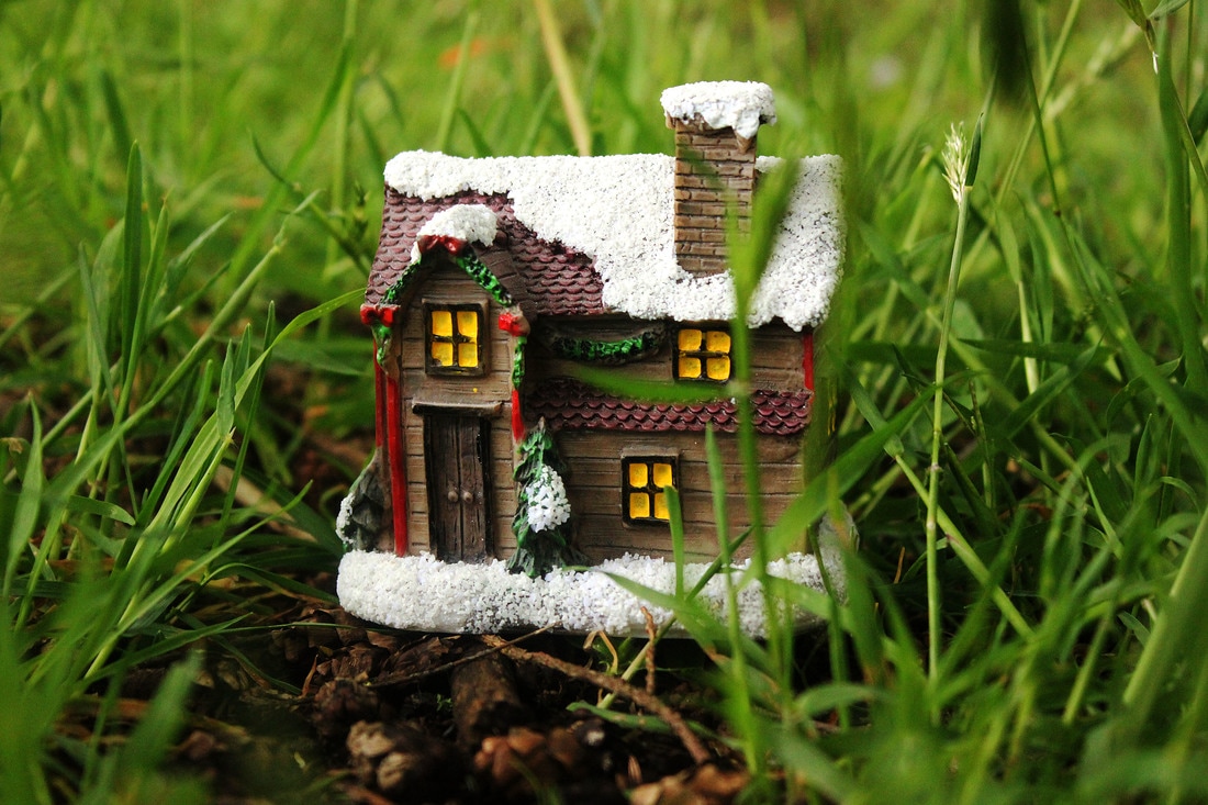
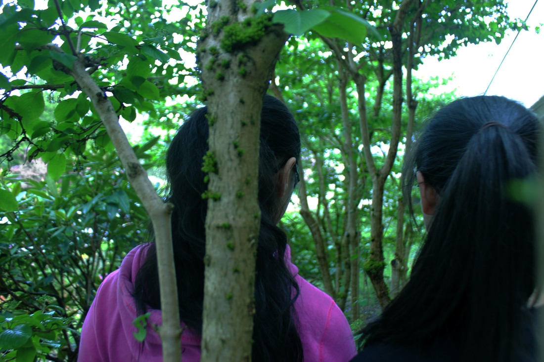
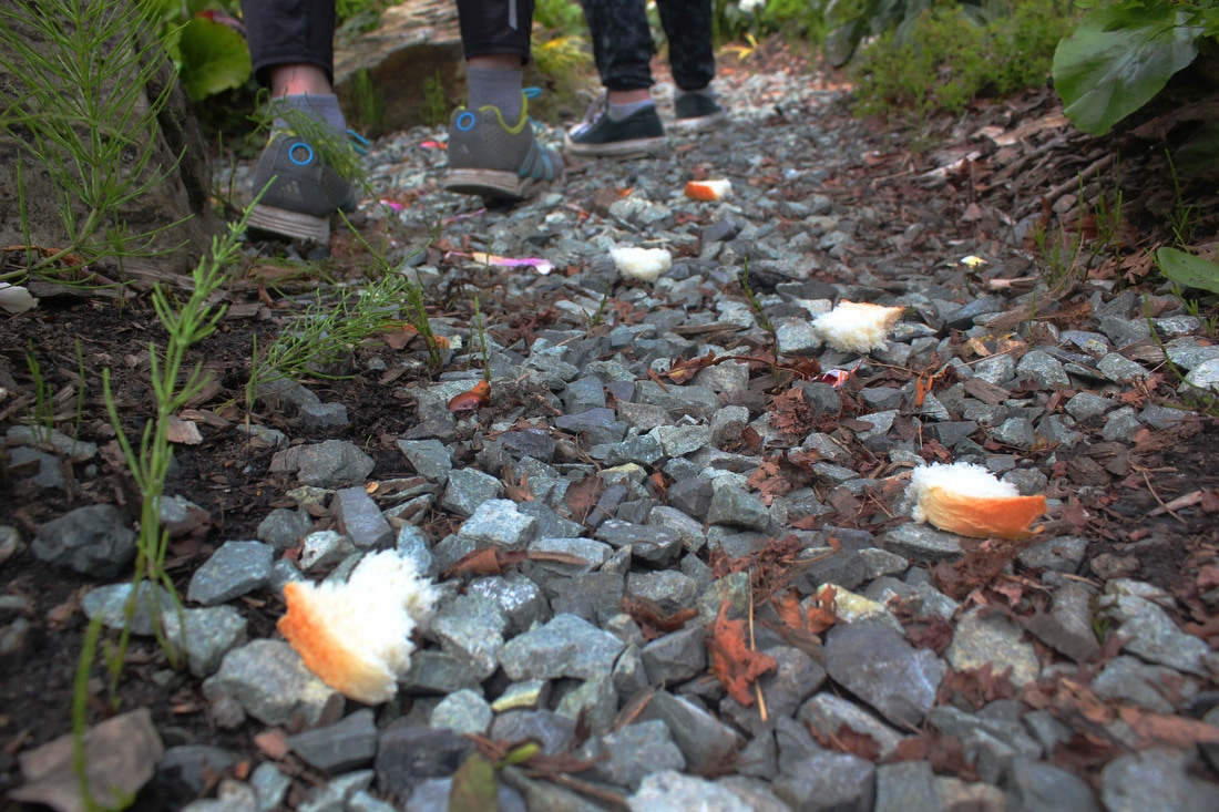
The fairytale that I decided to represent was Hansel and Gretel. The first character picture depicts the antagonist of the story, the nameless Old Hag. Because my model, Rosy, wasn’t actually wearing a black hoodie, I used Photoshop to make the hoodie black as well as darken the background to make her seem more mysterious. The other picture I took for the character is of Hansel and Gretel. I changed the curves of this picture to make the forest darker and the green more vibrant so that it seems as though the forest is thicker. The picture shows Hansel and Gretel in the forest because they are known for getting thrown into the forest and finding the candy house. Speaking of the candy house, one of my pictures for symbols was of the “candy house”. It is actually a miniature house that I bought from the dollar store, but I used a low angle and the grass to make it seem as though the house could exist in the forest. The house isn’t actually candy, so you might have to use your imagination a bit for that one. My other picture for symbols was the picture of the breadcrumb trail. This is because Hansel and Gretel were known to leave a trail of breadcrumbs in an attempt to mark their way so they know how to escape the forest.
textures
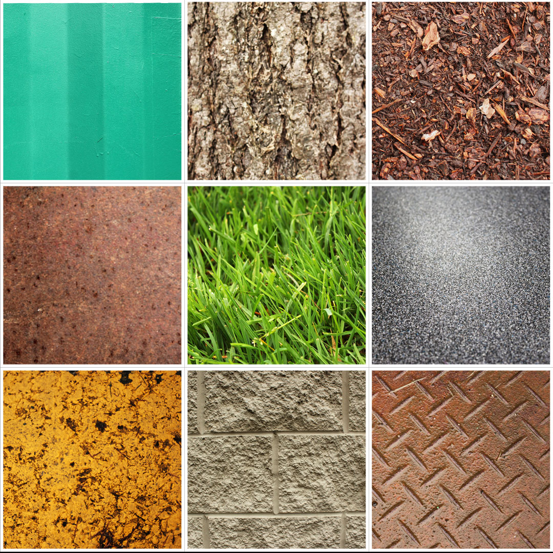
For this assignment I took pictures of 9 different textures that I found around the school. There is a picture of a metal storage container, the bark of a tree, wood chips, a rusting metal plate, grass, the table in a classroom, a yellow speed bump, the painted concrete wall of the school, and a metal grate. For all the pictures, I tried to get a very close-up picture so that the texture was very uniform throughout the picture. Afterwards, I edited each of them. I made the colours more vibrant and all of the pictures clearer using the unsharp mask. Finally, I put all the pictures together using layer masks to cover up parts that would overlap. When arranging the photos, I tried to keep all the similar colours far away from each other.
Jekyll and hyde
|
|
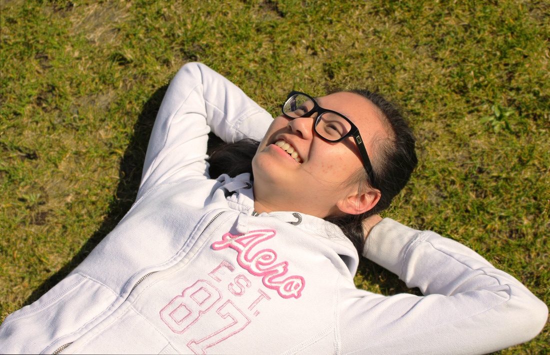
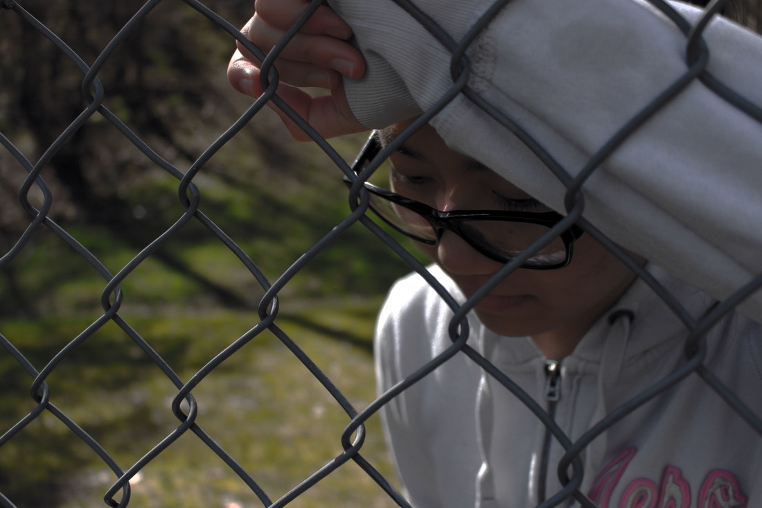
The two emotions that I chose for my Jekyll and Hyde project were carefree and troubled. For the carefree picture I got Rosy to lie down on the grass field in the sunlight. The natural lighting of the sun creates a warm and relaxed feeling to the picture. Also the way that Rosy has her arms under her head and a smile on her face, makes it seem as though she is happy and carefree. When editing, I also made the image warmer by adding a slightly orange filter over the photo. For the picture displaying the troubled emotion, I had Rosy look down and lean against a fence that was slightly more away from the direct sunlight. The way that the lighting covers her face in shadows gives the picture a more downcast look. I like the way that the fence almost makes it look as though she is trapped, which also adds to the emotion of the portrait. Because of how sunny and bright it was when I took the picture, I went into Photoshop and turned the brightness down. In editing, I also made all the colours more dull to make the image give out a negative mood.
Over/Under Exposure
|
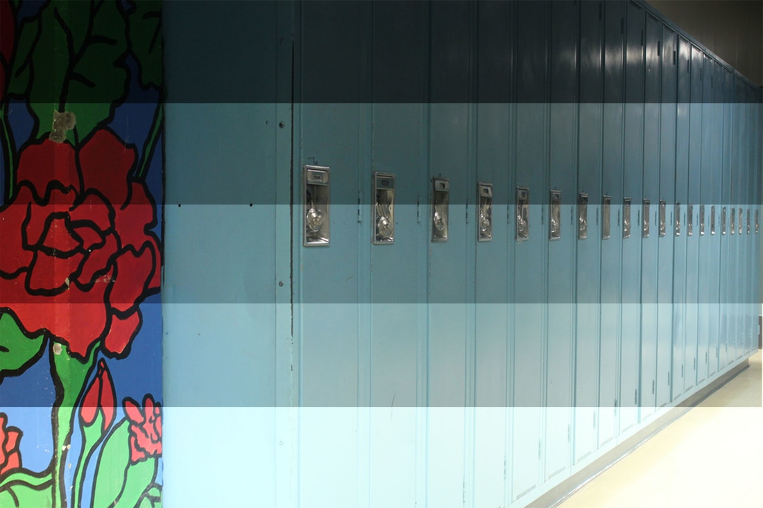
For this photo project, I used a tripod and set up my camera by the lockers. I took a picture with the exposure at -2, -1, o, 1, 2. I took all the pictures and put them into one photoshop file in order of lowest exposure to highest exposure. Afterwards, using a ruler tool I found out how to divide the picture into 5 equal strips. Using layer masks I made it so that each picture only showed in one strip.
|
Hybrid Animals
Animal x Animal
Keerten
|
Animal x Object
Petalfly
|
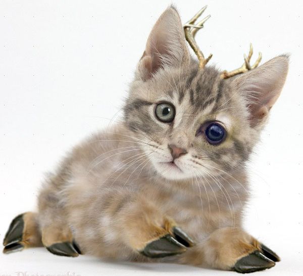
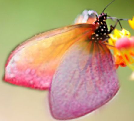
In this editing assignment I made these two hybrids. The first is of a kitten that I added deer parts to. I gave the kitten a deer eye, deer hooves, deer antlers, and a deer pattern lightly in the fur. I did some blurring and colour adjusting to make the parts blend together nicely. In the petalfly picture, I took a picture of a butterfly and layered petals from two different flowers onto its wings. Afterwards, I used the eraser on a low opacity and erased parts of the wings that were closer to the body of the butterfly so that the design of the wing can be seen through the petal. This also made the petals blend more naturally into the wings.
Winter/Holiday
|
|
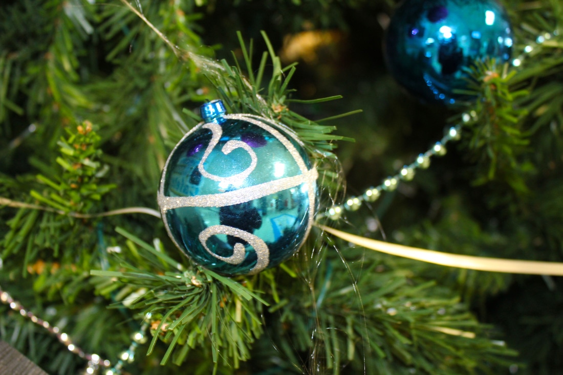
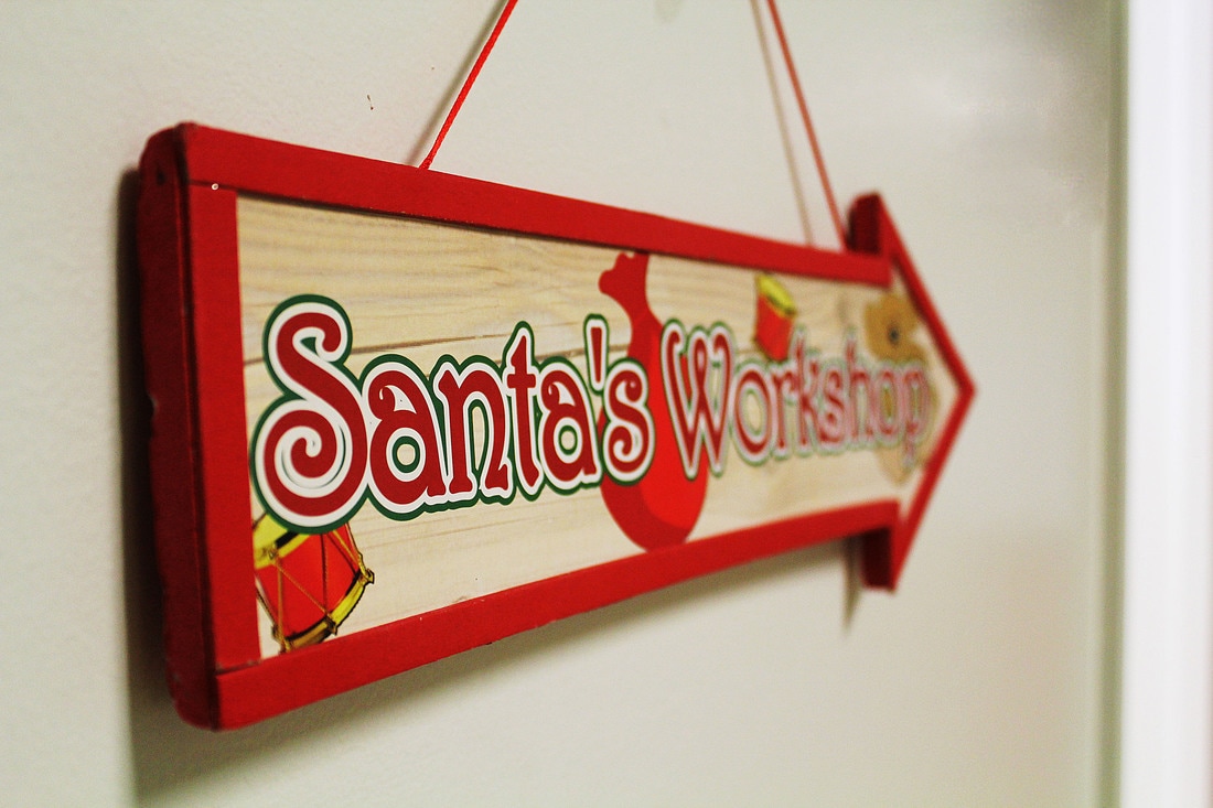
For this assignment I got some pictures that reminded me of the holiday season. I took the picture of the ornament because it makes me think of how everything is always so beautiful around Christmas time as everything is very well decorated with lights, tinsel, shiny ornaments and more! In the other picture, I took a picture of a sign saying “Santa’s Workshop” because another very popular thing that happens at Christmas time is gift giving and who gives more gifts than Santa. Also Santa’s workshop is where all of the gifts he gives are supposedly made.
Love
|
|
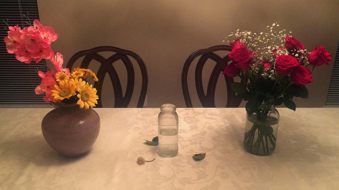
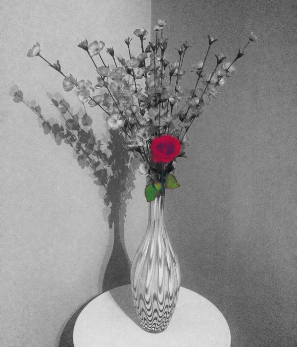
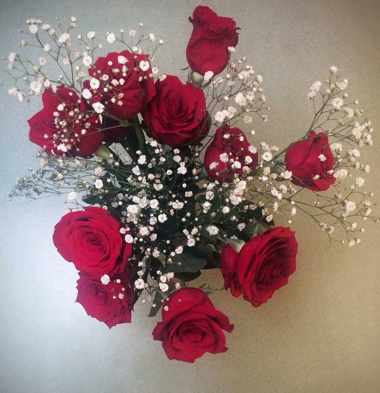
For my project to do with love, the first picture I took was of a rose in a vase with a bunch of other flowers. In editing, I duplicated it and made the duplicated image black and white and covered the part with the rose with a layer mask so that the colour of the original photo could show. Then to make the rose pop more, I made the colours of the original brighter and bolder. In my mind this picture represented the whole mindset of “when you’re in love, even if you look into a crowd of people, the one you love will always be the first one you see”. My second picture was meant to represent “you” in the middle and people around you as the other vases. The concept was that the people around you are in love their love is blooming (haha puns, sorry), but you are alone and your love has died and is shown through the dead flower. In the last photo, I took the top down picture of the roses. I took this picture mainly because of how the point of view looked.
Editing
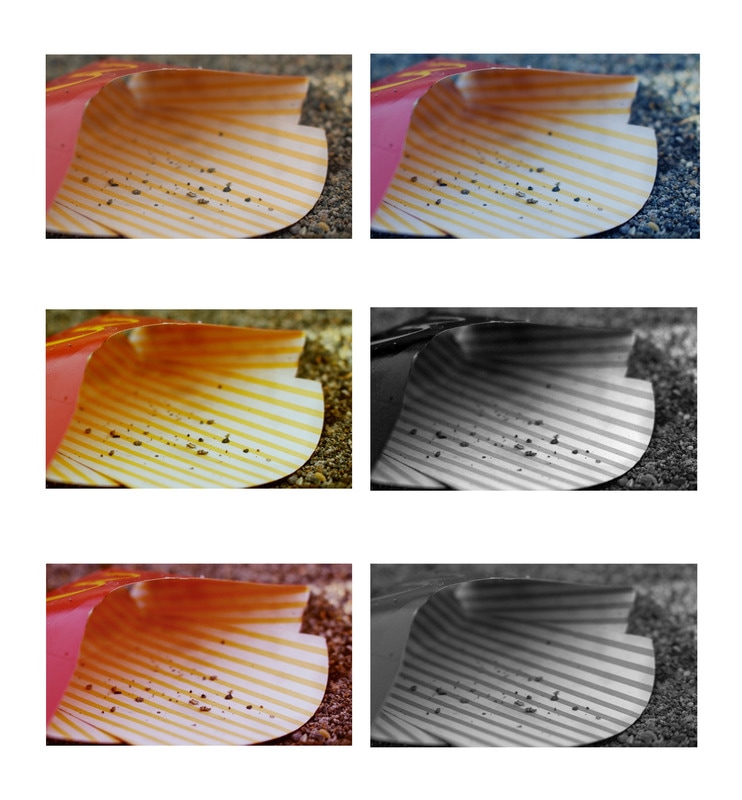
In this project I took a picture of an empty McDonalds fries container I saw on the baseball diamond. In each picture I adjusted the curves and sharpened the picture. The first picture is the original picture. The second one is a picture that I adjusted the colour balance on and made it have a yellow tint. The third one has a red tint that I created with the colour balance. The fourth picture I also edited by changing the colour balance, however I used a blue tint instead. I think it's cool that all three of these pictures have very different feels to them just by adjusting the colour tint. In the fifth and sixth picture I added a black and white filter to it. The difference between the pictures is that the first one has high contrast and the second one has low contrast.
Principles of Design
This project was all about the many different principles of design. The pictures I chose from it show emphasis, movement, rhythm, unity, variety, and balance. All of these pictures were edited in photoshop. I adjusted the curves and used and unsharp mask on all of them. In the picture for emphasis, I also made all colours, except for ones on the rose, duller so that the red and green would stand out more.
